Sub Rows & Columns
The video below shows how to create sub-columns and specifying gutter spacing
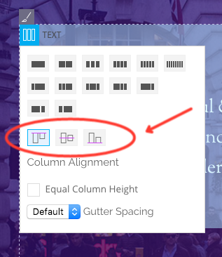
Column Alignment
You can also set the column alignment on any row with the column alignment feature. This option can be found when you hover your cursor on the top left corner of your column panel. You can choose to set it to top, mid, or bottom. What this does is that it moves your module to have the same alignment across the row or sub row.
Note: The column alignment feature will not appear on your row if you’ve only set it to showcase one column. This feature will only appear, if you’ve set it to show more than one column in your row.
Row, Column, and Module Styling
Row Styling
The following options are available in Row > Options > Styling tab:
- Row Width = This option is used to set the width of the row, either select the default page width or Fullwidth.
- Note: Fullwidth row is only available using Themify themes when the Content Width option in Themify Custom Panel is set to Fullwidth.
- The Builder Plugin version does not have this option because the width is inherit from the theme styling.
- Row Height = This option is used to set the height of the row
- Fullheight = 100% viewport (browser viewing area) height
- Background Mode
- Parallax Scrolling = This option is used to add a parallax scrolling effect to the background image.
- Background Video = This option is used to to add a background video to the row.
- Note: video background does not support on mobile, background image will be used as fallback.
- Background Slider = This option is used to to add an image slider to the background of the row.
- Best Fit = slider images will be fit within the row
- Fullcover = slider images will scale to fully cover the row
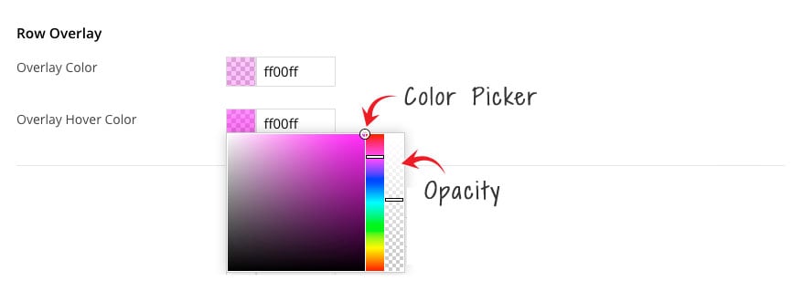
- Row Overlay = This allows users to create a color overlay on top of their background image/slider/video. The following options are available on the row overlay options:
- Overlay Color – The base color that users see on top of your background image.
- Overlay Hover Color – The color that appears when user cursor hovers over the row.
- When clicked the following options will appear on both these options:
- Color Picker – This allows you to choose any color you would to appear on the row
- Opacity – This gives you to the ability to choose the level of transparency of the color you choose.
Row & Module Styling
The following options are available in both Row and Module > Styling tab:
- Background = As the name suggests, this feature allows you to add backgrounds to the element
- Background Image = This option is used to set the URL of the background, you can either upload or add background using the media library.
- Background Mode
- Repeat All = The background image will be tiled (repeat all)
- Repeat Horizontally = The background image will repeat horizontally
- Repeat Vertically = The background image will repeat vertically
- Do not repeat = This background image as it is (without repeating)
- Fullcover = The background image will fill and fit in the container complete
- Background color = This option is used you to add a flat color to the background of the row.
- Font = This option is used to change the font styling.
- Link = This option is used to add text decoration and to change the color of the links in the row.
- Padding = Padding refers to the inner space of the container
- Margin = Margin refers to the outer space of the container
- Border = This option is used add border around the element
- Additional CSS Class = This option is used to add any custom CSS classes you wish to be output with the row (refer to “Custom CSS Class“).
Column Styling
The following options are available in Column Styling (refer to the notes above for details of each option):
- Background
- Font
- Padding
- Border
Note: The styling options available for the individual Modules works similarly to the Row styling options.
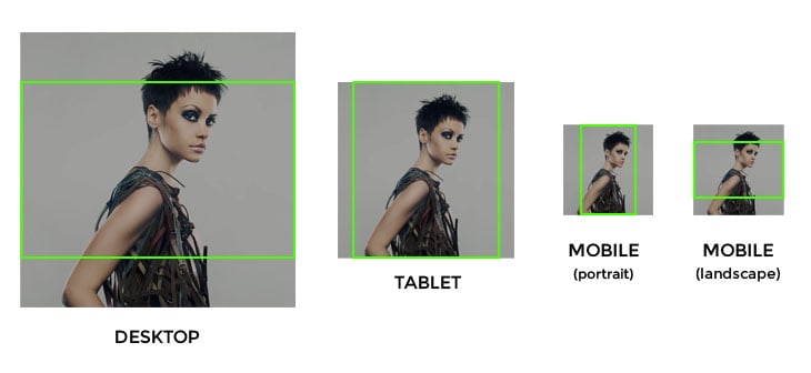
How Row Background Image Works
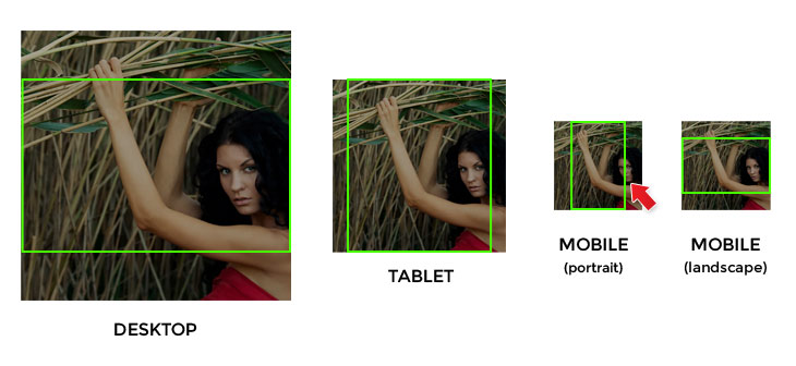
Good BG Image
The image below illustrates how background image displays on different devices/resolution. By default, the parallax and fullcover background image is displayed in the center. So you can see that the image is fine because the subject (which is the girl model in this example) is in the center of the image.
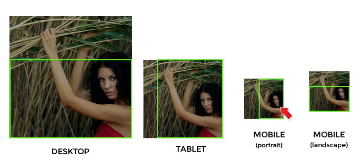
Bad BG Image
However, if the image subject is on the side like the example below. You will see how the face of the model is being covered on certain resolution because the image is positioned in the center.
How to Fix Bad BG Image
To resolve this problem, we’ve added the “Background Position” option in the Builder row background options. To access this you’ll need to turn on the Builder > Click on the Styling (Paintbrush Icon). There you will find the “Background Position” option where you can select where you would like to position or center the image as its viewed in various devices.
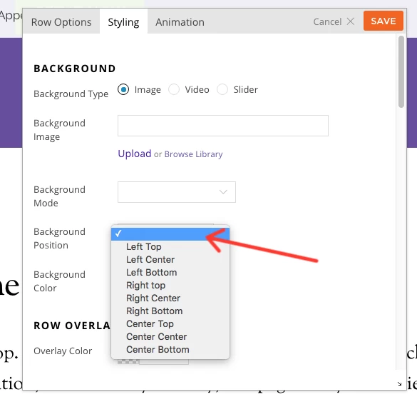
By selecting the background position (for this example, we will select “right bottom”), you can keep the image subject in the visible area.
Additional CSS Classes
You can add custom CSS classes to any module by entering a class name in the “Additional CSS Class” option field on the module options panel. Custom CSS is for developers who need to style the module appearance in an advanced level (it requires CSS knowledge to do so). Due to the complexity of CSS, it is not documented here. You may find all CSS related tutorials on the W3Schools site.
To add Custom CSS:
- For Themify theme: Custom CSS can be added in Appearance > Customize > Custom CSS
- For Builder plugin: Custom CSS can be added in the Themify Builder settings page > Custom CSS tab
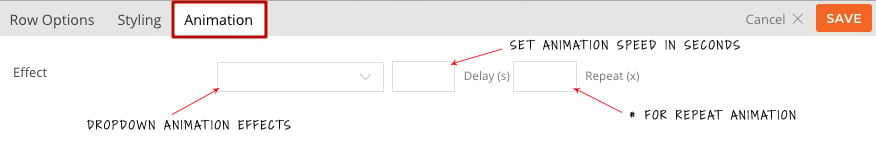
Animation
Animation is the transition effect that triggers when the elements present in the viewing area. It can be set to rows and modules individually. There are over 60+ animation effects. To apply animation:
- Row: select Row > Options > Animation Tab, then select the “Effect” dropdown. You can also set the animation speed in seconds, and the number of times you would like the animation to repeat.
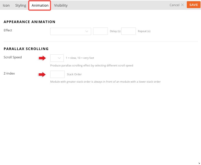
- Module: All modules comes with 2 animation options.
- Appearance Animation: Similar to the row animation, simply select the desired effect from the dropdown list. The element will then animate as soon as it hits the viewing area.
- Parallax Scrolling:
- Scroll Speed: Produce parallax scrolling effect by selecting different scroll speed. 1 = slow and 10 = very fast.
- Note: The faster you set the speed the higher the module will scroll up.
- Z-index: Module with greater stack order is always in front of an module with a lower stack order. This option allows you create an overlapping effect with all your modules.
- Scroll Speed: Produce parallax scrolling effect by selecting different scroll speed. 1 = slow and 10 = very fast.
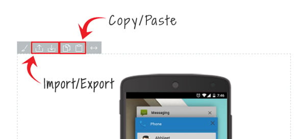
Draggable Column, Import/Export, & Copy/Paste
To swap columns in the previous version, you have to manually drag and drop the modules from column-A to column-B, and then drag the modules from column-B to column-A. Now you can easily drag and drop the entire column including all its styling, modules, and animation from one location to another on the same row.
A time saver feature that we’ve added to columns is the copy/paste and import/export. Now you can easily transfer the entire content of one column to another without having to do it one module at a time. Simply click on the copy icon on the column top bar and then click the paste icon on the column where you want to transfer the data to. In addition to this, you can also import/export column as well. This allows you send column data with clients, which they can import to their site.