
Accordion
The Accordion module is used to display content in content boxes which can be toggled open and closed with an accordion effect.
To use the Accordion module:
- Enter a title for the accordion tab under the “Accordion Title”
- Enter the text to show within the accordion tab under the “Accordion Text”
- To delete or duplicate a row: hover over the row menu icon (top left icon of the row)
- To add a row: just click the “Add new row” button
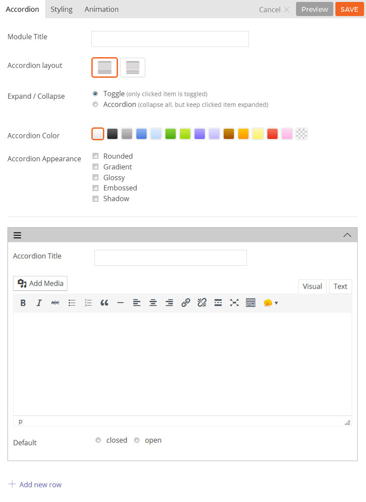
- Module Title This option is used to add the title of your module.
- Accordion Layout This option is used to determine the layout and style of the accordion module and will affect how the tabs are shown.
- Option 1 This layout will show the tab headings and content as one block.
- Option 2 This layout will show the tab headings separate from the content in two blocks.
- Expand / Collapse This option is used to change what will happen when a user clicks on an accordion heading.
- Toggle When clicking on a tab heading the selected tab will open and other tabs will still remain open.
- Accordion When clicking on a tab heading the selected tab will open and other tabs will be closed.
- Accordion Color This option is used to change the color of the accordion module.
- Accordion Appearance These options provide the ability to toggle various effects for the accordion boxes.
- Rounded Toggles whether the corners of the module’s content will be rounded.
- Gradient Toggles whether the module will have a gradient effect applied to it.
- Glossy Toggles whether the content area will have a gloss overlay effect applied to it.
- Embossed Toggles whether the module will have an emboss effect applied to the edges.
- Shadow Toggles whether the module will have a shadow effect applied to it.
- Icon Add an icon that’ll appear when your accordion is opened or closed
- Accordion Title The title shown in the accordion heading for each accordion tab.
- Accordion Text The text shown in the accordion content area for each accordion tab.
- Default Open / Closed This option determines whether a tab defaults to open or closed.
- Add New Row This option adds a new row to add more accordion tabs.
- Additional CSS Class This option allows you to add any custom CSS classes you wish to be output with the module.
Tab
The Tab module is used to add a content box where the content can be switched with the tab buttons.
To use the Tab module:
- Enter Tab Title
- Enter Tab Content
- To delete/duplicate a Tab: hover over the row menu icon (top left icon of the row)
- To add a Tab: just click on the “Add new row” button
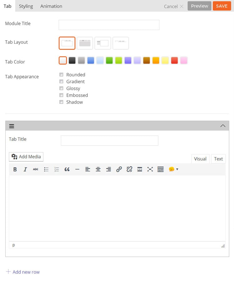
- Module Title This option is used to add the title of your module.
- Tab Layout This option is used to determine the layout of the tabs and content.
- Option 1 Tabs will be shown horizontally with tab titles and content shown as one block with borders around the content.
- Option 2 Tabs will be shown horizontally with tab titles and content shown as two separate blocks with borders around the content.
- Option 3 Tabs will be shown vertically with content in a box.
- Option 4 Tabs will be shown horizontally without borders around the content.
- Tab Icon Select where the icon will be placed on the tab. You can choose from the following: Icon beside the title, Just above the title, Just icons
- Tab Color This option is used to select the color of the module.
- Tab Appearance These options provide the ability to toggle various effects for the tab buttons and content area.
- Rounded Toggles whether the corners of the module’s content will be rounded.
- Gradient Toggles whether the module will have a gradient effect applied to it.
- Glossy Toggles whether the content area will have a gloss overlay effect applied to it.
- Embossed Toggles whether the module will have an emboss effect applied to the edges.
- Shadow Toggles whether the module will have a shadow effect applied to it.
- Tab Title The title shown in the tab button.
- Icon Add an icon that appear on a tab.
- Tab Content The content shown when the tab is selected.
- Add New Row Used to add a new tab to the module.
- Additional CSS Class This option allows you to add any custom CSS classes you wish to be output with the module.
Divider
The Divider module is used to add a border divider between the other modules.

Options are as follows:
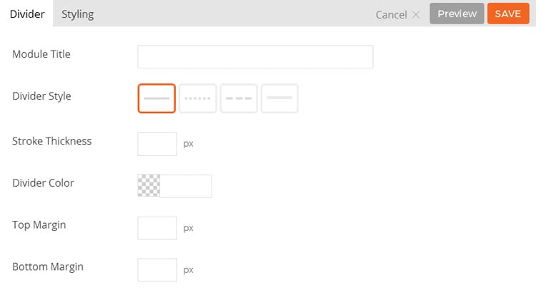
- Module Title This option is used to add the title of your module.
- Divider Style This option is used to determine the line style of the divider.
- Option 1 The divider will be shown as a solid line.
- Option 2 The divider will be shown as small dashes.
- Option 3 The divider will be shown as large dashes.
- Option 4 The divider will be shown as two lines parallel to one another.
- Stroke Thickness This option is used to set the line thickness of the divider.
- Divider Color This option is used to change the color the divider will show in.
- Top Margin This option is used to set the margin space above the divider.
- Bottom Margin This option is used to set the margin space below the divider.
- Additional CSS Class This option allows you to add any custom CSS classes you wish to be output with the module.