
Box
The Box module is used to display a box of content, using the standard WordPress WYSIWYG editor. You can also insert shortcodes with the Box module.
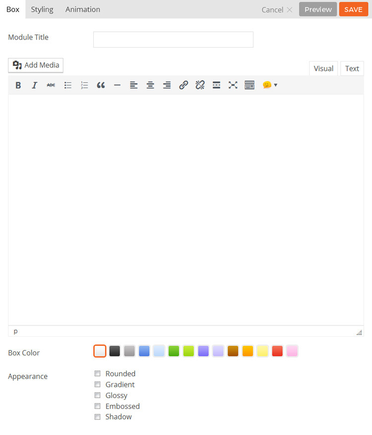
- Module Title This option is used to add the title of your module
- Editor Here you can add the content you wish to be displayed in the box module using the WordPress WYSIWYG editor.
- Box Color This option is used to change the color of the box module.
- Appearance These options provide the ability to toggle various effects effects to be applied to the box.
- Rounded Toggles whether the corners of the module’s content will be rounded.
- Gradient Toggles whether the module will have a gradient effect applied to it.
- Glossy Toggles whether the content area will have a gloss overlay effect applied to it.
- Embossed Toggles whether the module will have an emboss effect applied to the edges.
- Shadow Toggles whether the module will have a shadow effect applied to it.
- Additional CSS Class This option allows you to add any custom CSS classes you wish to be output with the module.
Callout
The Callout module is used to display a content box with an associated action button.
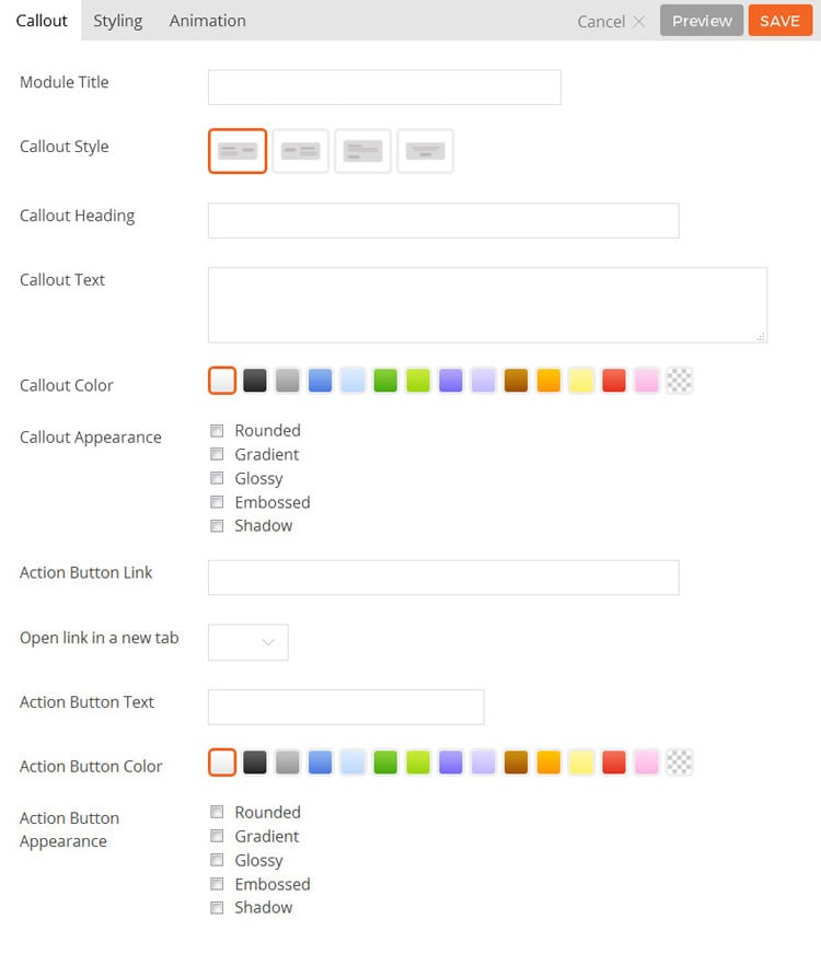
- Module Title This option is used to add the title of your module
- Callout Style This option is used to determine the style of the callout box and will determine how the callout text and action button are shown.
- Option 1 The callout text will be shown on the left and the action button will be shown on the right.
- Option 2 The callout text will be shown on the right and the action button will be shown on the left.
- Option 3 The callout text will be shown above the action button and the content will be left aligned.
- Option 4 The callout text will be shown above the action button and the content will be center aligned.
- Callout Heading This option is used to set the heading text of the callout box.
- Callout Text This option is used to set the body text of the callout box.
- Callout Color This option is used to change the color of the callout box.
- Callout Appearance These options provide the ability to toggle various effects for the callout box.
- Rounded Toggles whether the corners of the module’s content will be rounded.
- Gradient Toggles whether the module will have a gradient effect applied to it.
- Glossy Toggles whether the content area will have a gloss overlay effect applied to it.
- Embossed Toggles whether the module will have an emboss effect applied to the edges.
- Shadow Toggles whether the module will have a shadow effect applied to it.
- Action Button Link This option is used to set the link URL of the action button.
- Action Button Text This option is used to set the text that will show inside the action button.
- Action Button Color This option is used to change the color of the action button.
- Action Button Appearance These options provide the ability to toggle various effects for the action button.
- Rounded Toggles whether the corners of the module’s content will be rounded.
- Gradient Toggles whether the module will have a gradient effect applied to it.
- Glossy Toggles whether the content area will have a gloss overlay effect applied to it.
- Embossed Toggles whether the module will have an emboss effect applied to the edges.
- Shadow Toggles whether the module will have a shadow effect applied to it.
- Additional CSS Class This option allows you to add any custom CSS classes you wish to be output with the module.
Feature
The feature module is used to showcase features or services of your organization with an animated circular progress bar around the icon or any custom image.
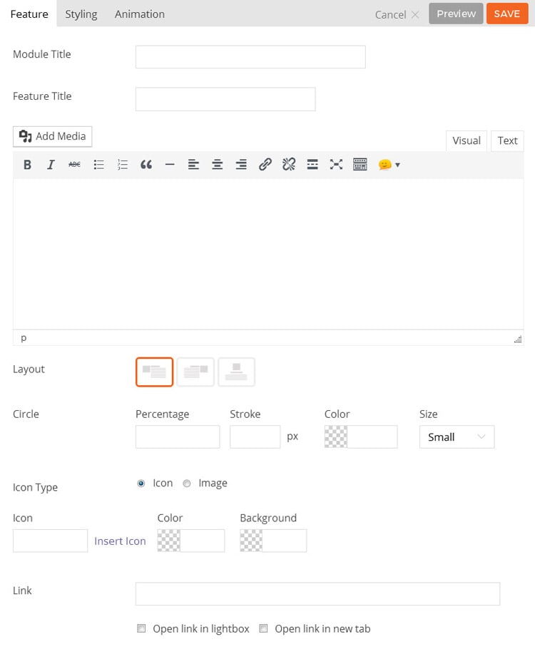
- Module Title This option is used to add the title of your module
- Feature Title Here you can add the content you wish to be displayed in the box module using the WordPress WYSIWYG editor.
- Editor Here you can add the content you wish to be displayed in the feature module using the WordPress WYSIWYG editor.
- Layout This option is used to set the icon position, it has three options.
- Icon Left Displays the selected icon to the left of the content.
- Icon Right Displays the selected icon to the right of the content.
- Icon Top Displays the selected icon the top of the content.
- Circle Percentage This will set the percentage of the circular progress bar to be filled when animated.
- Circle Stroke This will set width of the circular progress bar.
- Circle Color This will set the color of the circular bar around the feature icon.
- Circle Size This will set the size of the circle, choose the desired size from the dropdown, “Small,” “Medium” and “Large.”
- Icon Type This will set the icon or images to be used for the feature module using the Font Awesome icon library or else you can also define custom image using WordPress media library.
- Icon This will set the icon to be used for the feature module using the Font Awesome icon library.
- Icon Color This will set the color of the icon to be used for the feature module.
- Icon Background This will set the color of background for the icon to be used for the feature module.
- Link This option is used to link the icon or your custom image and title to a custom URL.
- Lightbox Link This option is used to link the icon or custom image and title to open a URL in lightbox.
- Open the link in new tab If checked this will open the URL into a new tab.
Text
The Text module is used to add a text area to the page. You can use the visual editor to enter any rich format text including images, videos, links, heading, etc. Shortcodes are supported with the Text module, therefore you can insert any shortcode as you do in post/page content.
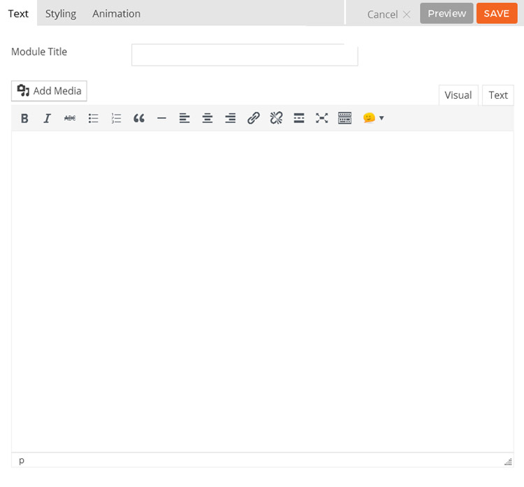
- Module Title This option is used to add the title of your module.
- Editor You can use the WYSIWYG editor to add any content required to be shown in the module.
- Additional CSS Class This option allows you to add any custom CSS classes you wish to be output with the module.