Visibility Control
You can set the rows and modules whether to be visible on specific device viewing (desktop, tablet, and mobile). By default, all device viewing are visible.
- To set Visbility: edit any row or module, click on the Styling tab, select “Hide” to hide the object
- Desktop = Hide desktop will hide object when viewport is larger than 1024px
- Tablet = Hide tablet will hide object when viewport is between 680px and 1024px
- Mobile = Hide mobile will hide object when viewport is less than 680px
Responsive Styling
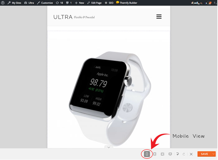
This features allows you to style how your site looks on tablet, mobile, or desktop. To access this feature, first turn on the Builder > On the module panel, above the “Save Now”, hover your cursor over the desktop icon. There you can toggle various options on how you would like to view and style in various devices.
Notes: When you edit the styling in both tablet or mobile view, you’ll notice that the Builder module panel will shrink and lose access to all the modules. This means that when when you’re editing the styling in tablet or mobile view, you cannot add or edit the Builder content. You can only change the styling of the row, column, and module.