
Builder Tiles
With the Builder Tiles module you can create masonry tile layouts that’s similar to the Windows 8 Metro desktop style. Both front and back tile are customizable with options to display text, icons, maps, buttons, or galleries. It also includes 10 flip effects with the option to set an auto flip timer.


How-To: Tiles
Plugin: Builder Tiles
Adding and Editing Tiles
There are two ways to add and edit tiles using the Themify Builder. The first way is adding the Tile modules in the edit page just like you would for any other Themify module. The other way is to click on “Turn on Builder” on the page itself. The second method is recommended for arranging the tiles because you can visually adjust the layout of the tiles rather than blindly ordering the tiles. When you add a Tile module, the settings for the module will pop up for you to edit.
General Settings
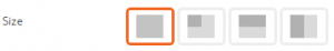
Tiles have four different sizes to choose from, and the size can be different for different tiles. The Square Large size is a square with the maximum dimensions for a tile. The Square Small size is a square with half the length and half the width of the Square Large size. The Landscape size is a rectangle with full width and half height, and the Portrait size is a rectangle with half width and full height.
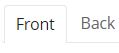
Each tile has a Front side and a Back side. Each side can have completely different settings, including different tile types, but the tile size must stay consistent. For example, a tile could be of the Blank type on the front side, but have a different type on the back side that appears when the tile is being hovered.
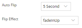
By default, tiles show their front side and flip to the back side when it is hovered. You can set a tile to flip between front and back sides automatically at a set interval using Auto Flip. However, the auto flip setting will be disabled once the tile has been hovered over by the user. The settings provide different flip effects that you can choose from for each tile.
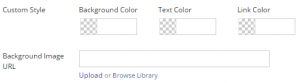
You can set the background of the tile to either a color or an image. The plugin settings provides a set of colors for you to choose under Tile Color, but you can choose your own color under Background Color in Custom Style. To set an image as the background, you can insert the image URL directly into the provided field or you can upload or select an image through the Media Library.
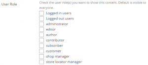
At the bottom of the tile settings there is a User Role section. You can choose to limit the visibility of tiles to a group of users based on their role.
Tile Types
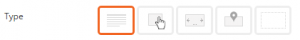
There are five different types of tiles: Text, Button, Gallery, Map, and Blank.
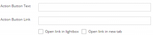
The Text tile is for text content. In the settings you can insert a title in provided field and the content in a Visual Editor. In addition, you can insert an Action Button at the bottom of the tile. Enter the text to be displayed on the button under Action Button Text and the link to be accessed under Action Button Link. You can choose whether to open the link in a lightbox (good for images and videos), in a new tab, or in the same tab if you leave both boxes unchecked.
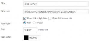
The Button tile makes the tile into a button to click to access a link. The Title of the tile becomes the only text that appears in the tile. Put the link to be accessed in the Title Link field. You can have the link open in a lightbox, in a new tab, or in the same tab if you leave both boxes unchecked. If the link is an image or a video, you should have it open in a lightbox. A lightbox displays images and videos without leaving the original page by expanding the media to fill the screen and dimming out the rest of the page. You can choose between a regular icon or an image for the icon. There are icons already available for you to choose, but you can upload your own icon or image to use. If you use a regular icon you can set the color of it.
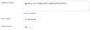
The Gallery tile shows a gallery of images that you can either upload or select from the Media Library. Clicking on “Insert Gallery” in the settings will direct you to the Media Library to upload and select the images. After selecting, the Gallery Slider field will contain a list of ids of the selected images. Auto play sets the amount of time that the slider stays on one image before automatically scrolling to the next image. You can set the time between 1 and 10 seconds, or turn it off. If you use auto play, Hide Timer sets whether or not to hide the progress bar that shows how long the current image has been displayed.
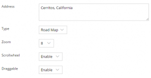
The Map tile shows Google Maps centered on a set point with a marker. To set the location enter the address in the given field. You can choose the type of map to display: Road Map, Satellite, Hybrid, or Terrain. You can set the initial zoom of the map, the higher the number the more zoomed in the map will be. Scrollwheel sets whether or not users can zoom in or out. Draggable sets whether or not users can drag the map to move around.
Lastly, a Blank tile is a tile that does not appear. There are no settings except the visibility settings that appear in all tiles.