
Image
The Image module is used to add an image with title and caption on your site.
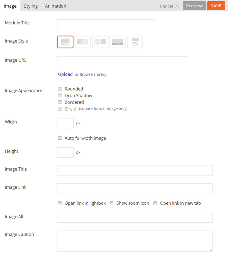
- Module Title This option is used to add the title of your module.
- Image Style This option is used to determine the layout of the image and any title and caption.
- Option 1 Title/caption will be shown below the image.
- Option 2 Image will be shown on the left and Title/caption will be shown on the right.
- Option 3 Image will be shown on the right and Title/caption will be shown on the left.
- Option 4 Title/caption will be shown in an overlay on top of the image.
- Image URL This option is used to set/upload an image URL to use for the module, or alternatively you can select an image from your website’s media library by selecting “Browse Library”.
- Image Appearance These options provide the ability to toggle various effects to be applied to the image.
- Rounded Toggles whether the corners of the element should be rounded.
- Drop Shadow Toggles a drop shadow effect on the element.
- Bordered Toggles a border around the element.
- Circle Toggles whether the element will be rendered as a circle. (Requires images used be square ratio.)
- Width This option sets the width of the image output.
- Height This option sets the height of the featured image output.
- Image Title This option is used to set the title of the image being added.
- Image Link This option is used to set the URL that is linked to by the image being added.
- Image Caption This option is used to set a caption for the image being added.
- Additional CSS Class This option allows you to add any custom CSS classes you wish to be output with the module.
Gallery
The Gallery module is used to add a standard WordPress gallery on your site.
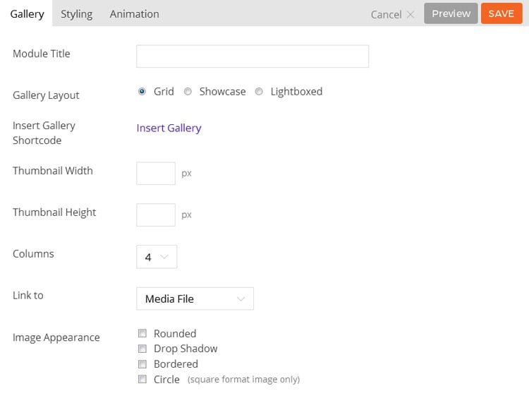
- Module Title This option is used to add the title of your module
- Insert Gallery Shortcode This option is used to add the gallery shortcode, either by entering it manually or using the “Insert Gallery” button. If selecting “Insert Gallery” you will be taken to the WordPress “Create Gallery” window where you can set up a gallery as documented here.
- Thumbnail Width This option is used to set the width the gallery thumbnails will be shown at.
- Thumbnail Height This option is used to set the height the gallery thumbnails will be shown at.
- Image Appearance This option provides the ability to toggle various effects to be used on the gallery thumbnails.
- Rounded Toggles whether the corners of the element should be rounded.
- Drop Shadow Toggles a drop shadow effect on the element.
- Bordered Toggles a border around the element.
- Circle Toggles whether the element will be rendered as a circle. (Requires images used be square ratio.)
- Additional CSS Class This option allows you to add any custom CSS classes you wish to be output with the module.
Open images in lightbox
To make the images in gallery grid open in lightbox make sure to set the Link To option to “Media File” when inserting the gallery: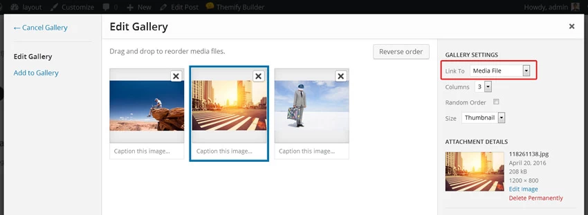
Video
The Video module is used to show a video embed (YouTube, Vimeo, etc.).
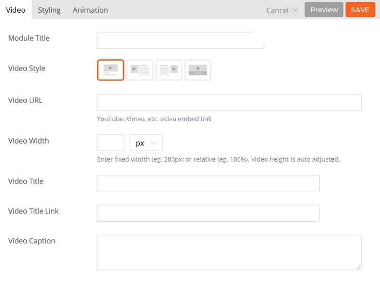
- Module Title This option is used to add the title of your module.
- Video Style This option is used to set the layout of the video and any title and caption.
- Option 1 The title/caption will be shown below the video.
- Option 2 The title/caption will be shown to the right of the video.
- Option 3 The title/caption will be shown to the left of the video.
- Option 4 The title/caption will be shown as an overlay on top of the video.
- Video URL This option is used to set the video URL to use for the module.
- Video Width This option is used to set the width of the video player.
- Video Title This option is used to set the title of the video being added.
- Video Title Link This option is used to set the URL that is linked to by the title.
- Video Caption This option is used to set a caption for the video being added.
- Additional CSS Class This option allows you to add any custom CSS classes you wish to be output with the module.
Map
The Map module is used to add an interactive Google map to the page. To display a Google Map, enter the full address and configure the available options.
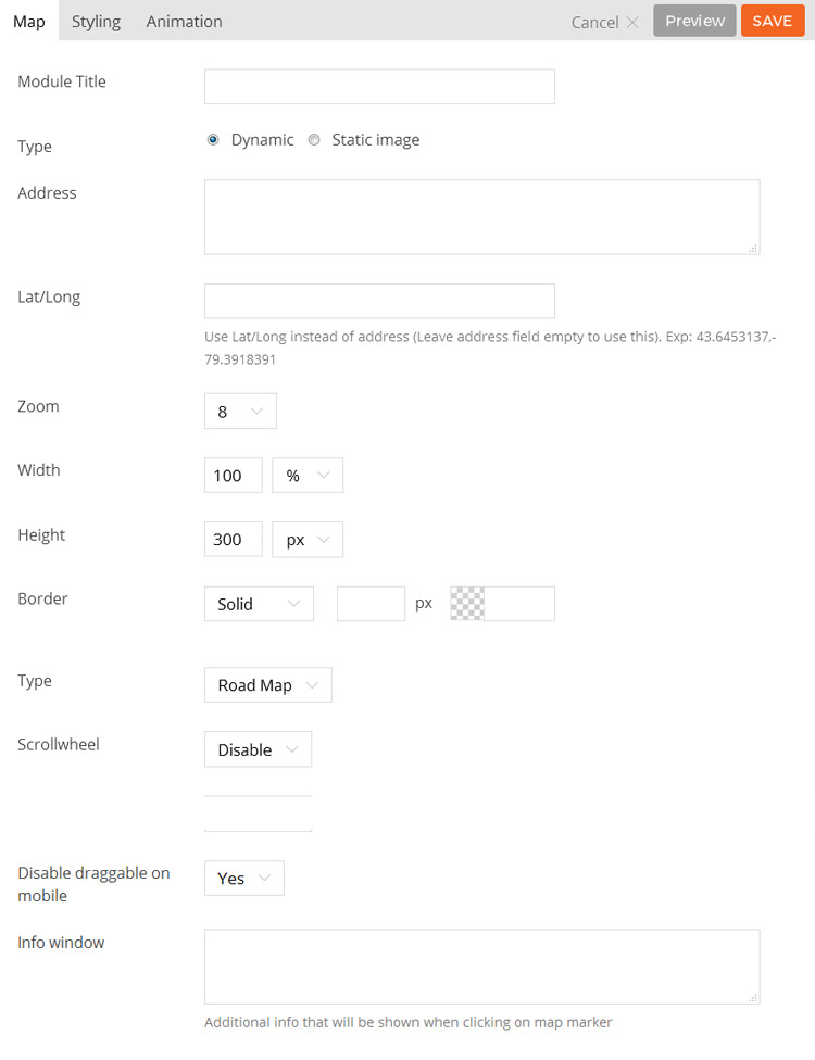
- Module Title This option is used to add the title of your module.
- Address This option sets the address the map should show when loaded.
- Zoom This option sets the default zoom level of the map.
- Width This option sets what width the map should be displayed at.
- Height This option sets what height the map should be displayed at.
- Border This options sets the styling of a border around the map element.
- Type This option set the type of map you want to be display, you can choose from the dropdown, “Road Map,” “Satellite,” “Hybrid” and “Terrain”
- Scrollwheel This options enable or disable the scrollwheel in the the map.
- Draggable This options enable or disable the Draggable feature in the map
- Additional CSS Class This option allows you to add any custom CSS classes you wish to be output with the module.